Question: When mapping data classes on a map, how do you avoid creating a busy oil & gas map with too many similar colors?
Answer: A map legend with too many data classes and colors can mean the difference between a map that is useful and informative, or a map that is too busy and overwhelming. Use too few classes and you risk over-generalizing the data. Use too many classes and you end up with 5 different shades of blue that you can’t distinguish between.
The ideal number of classes and colors can vary depending on several factors:
- Does the data represent magnitude or frequency?
- Are you coloring bubbles, wellbores, acreage, etc.?
- Are the colored shapes fixed in size or do they vary?
- Is the data spatially loose, or is it dense?
- Does the map span an entire basin, or just a few miles?
![]()
Data that varies in magnitude, EUR oil values for example, doesn’t require a wide range of colors. In most cases, this can be mapped effectively using a simple gradient scheme. Dark green bubbles represent high EUR values on one end of the spectrum, stepping down incrementally to pure white bubbles for low EUR values at the opposite end. If you need to add more distinction between high and low, scale the size of the bubbles according to their value to create a simple and intuitive map without a lot of color. Users will know that smaller/lighter bubbles represent lower EURs without looking at the legend.
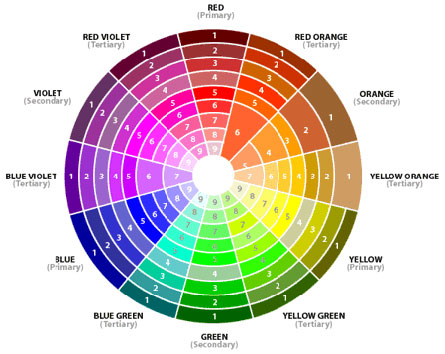
 Mapping on the presence/frequency of a text field, like operator or reservoir, will certainly require a wider range of colors, but there are guidelines that can help keep things from getting out of hand. It all starts with a color wheel.
If mapping 12 unique items by color, your first three color choices should be red, yellow, and blue, which are the “primary colors” found on a modern color wheel. These are considered primary because they’re the only 3 colors that can’t be made by mixing other colors. Your next color choices should be orange, purple, and green – aka “secondary colors” created by mixing the primary colors in equal parts. From there, you can quickly go from 6 colors to 12 by mixing the primary and secondary colors to create “tertiary colors” like magenta, brown, teal, lime, etc.
This is where a good color wheel – one that shows the primary, secondary, and tertiary colors in various shades – can be helpful. Instead of randomly choosing from the default color options in your mapping software, you can create 12 visually distinct colors by choosing one from each division of the wheel. If you need more than 12 colors, you can quickly pick up 2 additional ones by adding gray and black to the mix, bringing your total to 14 visually distinct colors. If you need more than this, circle back to your primary colors and add a much lighter or darker shade of each.
Here are a few additional tips for maximizing map legibility:
- If you must use two similar colors on a map, putting them in proximity will make them easier to distinguish.
- Include “count” on all legend items to provide an additional metric to help users distinguish between colors.
- When mapping data by count (e.g. reservoirs, operators) apply your lightest color to your highest count item.
- Use org as an alternative website/tool for coming up with color schemes.
- Disable outlines when coloring shapes to help increase legibility and make a map look less busy.
- Create layered PDF maps so that individual map features can be toggled on/off as needed to reduce clutter.
- Hire Cawley, Gillespie and Associates to make your next map!


